Typography 1. The Shenval Press, November 1936
Phil Abel • February 8, 2020
The first of eight typographical journals from the 1930s
I had the good fortune to grow up in a house where there were complete sets of Typography
and Alphabet & Image. My stepfather had subscribed to both.
They were published by Shenval Press, printers in Hertford run by the Shand family. James Shand, who was behind both those titles and two others - Image
and Motif
- was apparently a complex character. Ron Costley, who worked for him in the early 1960s, later remembered
that ‘James was always upsetting people by wanting to get things right.’ Ruari Maclean, who edited Motif, saw him as ‘a man of distinguished creativity both as a writer, talker, and designer, who had been forced to stifle these gifts in building up a commercially successful and famous printing business, the Shenval Press. A magazine gave him an outlet, besides being a showpiece for his firm’s printing skills.’
Typography
was edited, and no doubt designed, by Robert Harling, typographer, designer, editor, journalist and novelist, who lived a long and colourful life in London’s art, advertising and newspaper worlds. His style in both design and writing was lucid and entertaining.
Typography
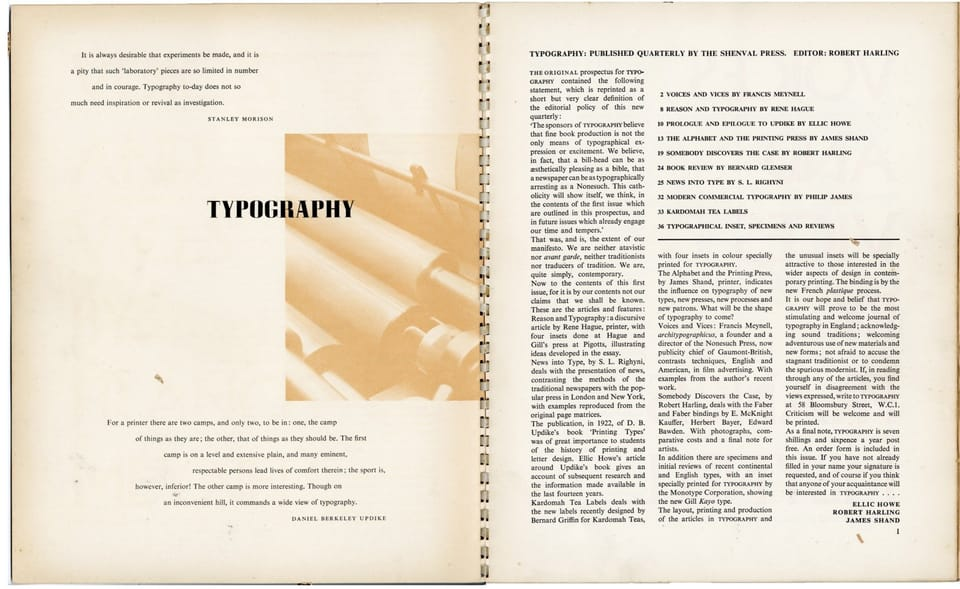
was a quarterly. An editorial on the first page of issue 1 sets out its aims, originally stated in a prospectus:
‘ “The sponsors of Typography
believe that fine book production is not the only means of typographical expression or excitement. We believe, in fact that a bill-head can be as pleasing as a bible, that a newspaper can be as typographically arresting as a Nonesuch. This catholicity will show itself, we think, in the contents of the first issue… and in future issues which already engage our time and tempers.”
‘That was, and is the, the extent of our manifesto. We are neither atavistic nor avant garde, neither traditionalists nor traducers of tradition. We are, quite simply, contemporary.’
When I decided, at the end of my twenties, to try to earn my living as a letterpress printer, these were exciting and inspirational words. They still are. The eight issues of those two journals, published either side of the second world war, were an important part of my education. I find it remarkable that more than eighty years later, that feeling of being contemporary still shines through.
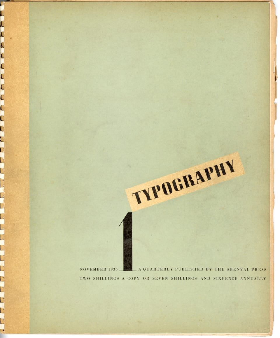
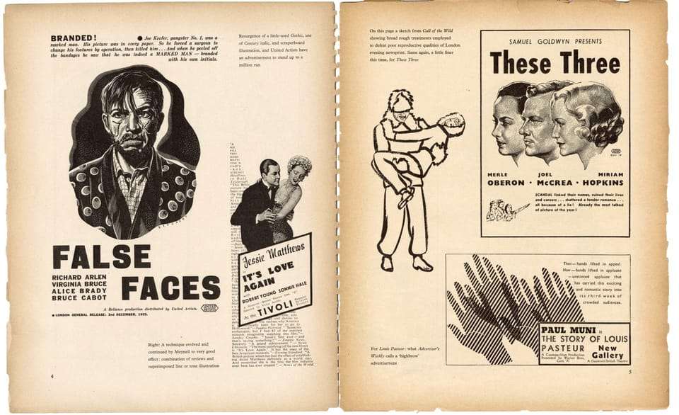
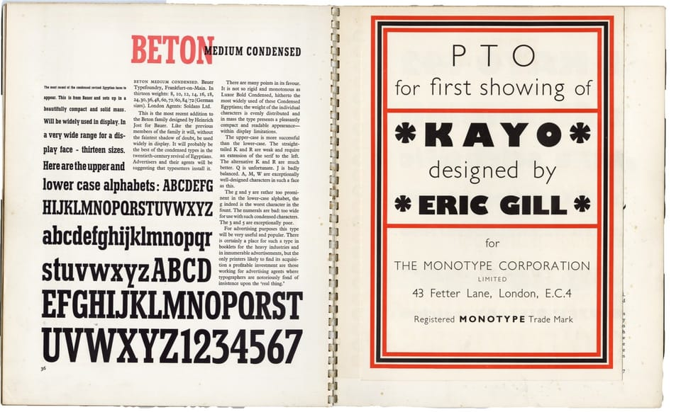
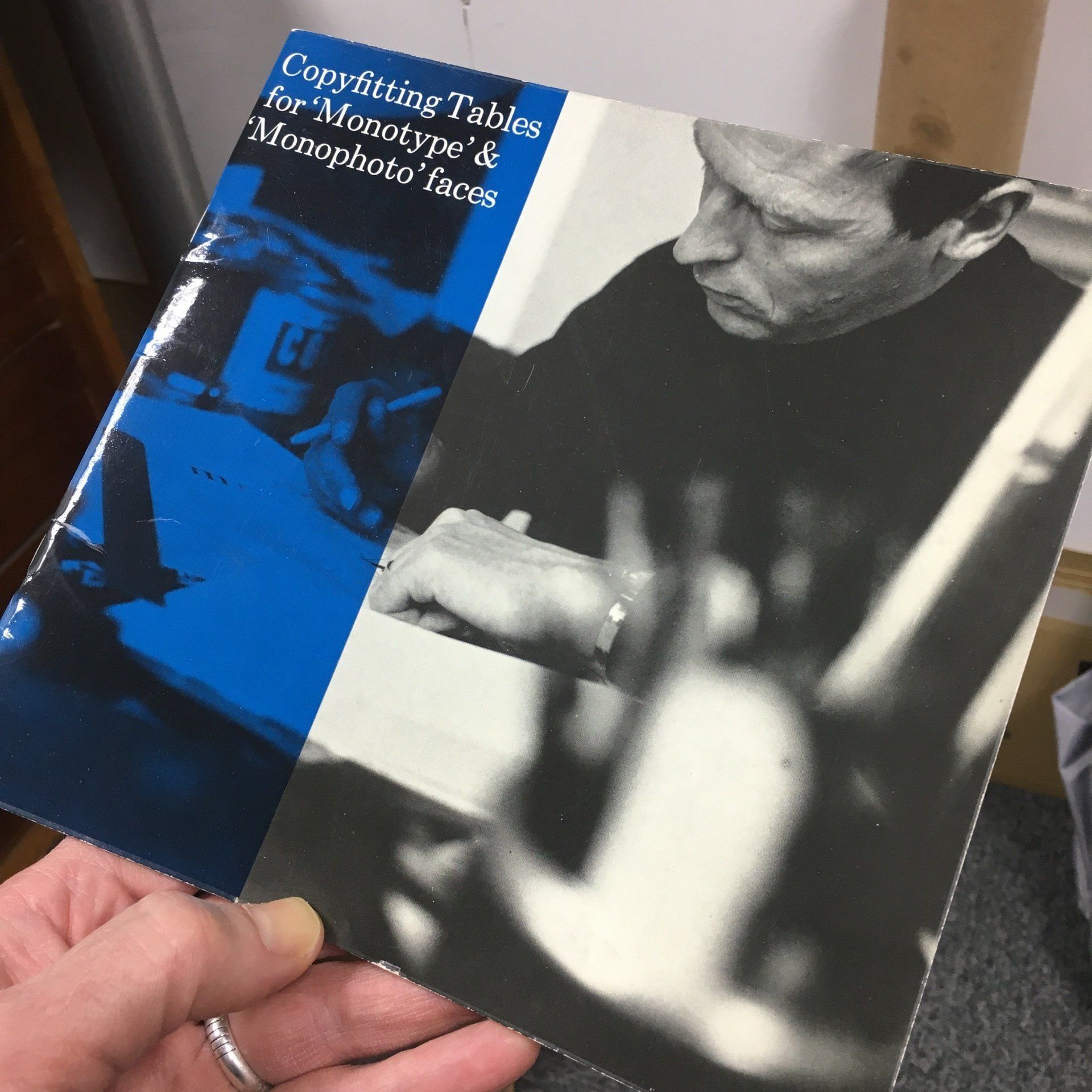
The front cover, now substantially discoloured.
Black type printed over a sepia half-tone was an often-used device.
Times New Roman was indeed new in 1936.
Alternating a title with smaller descriptive text was characteristic too.
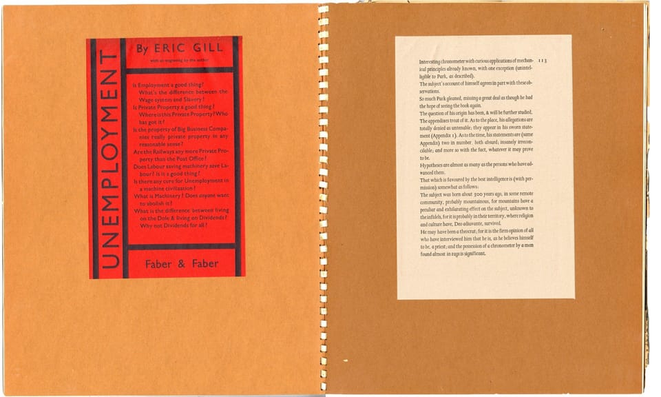
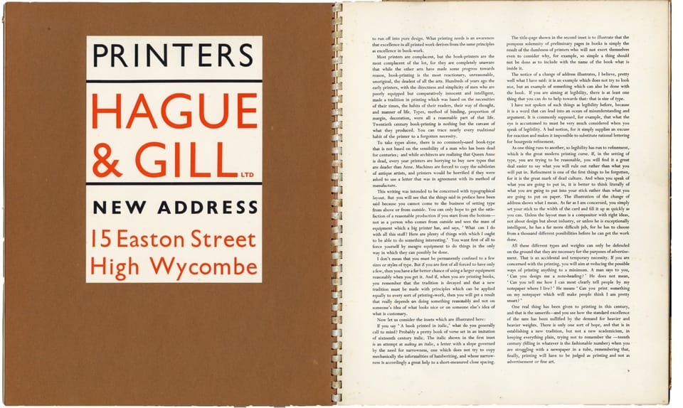
The then-new Plastoic plastic spiral binding allowed the use of different papers without the restriction of section binding. These pages are printed on newsprint that has browned and become faded over the last eighty-three years.
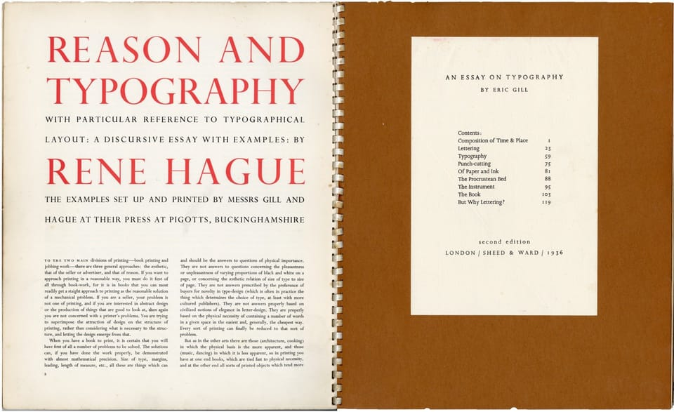
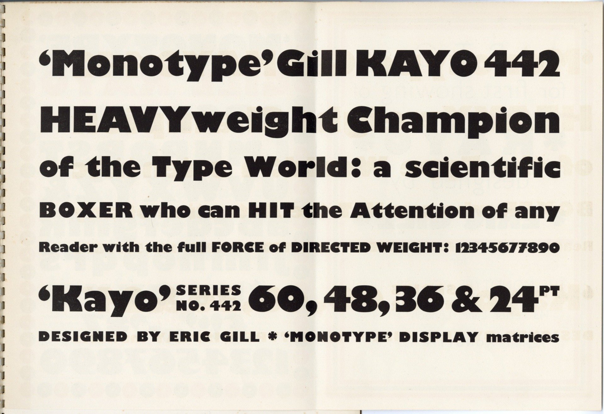
At the time Joanna, seen here in roman on the right, was exclusive to Hague & Gill. It was designed for the firm by Gill and cut for hand composition by Caslon. It differs from both the hot metal and digital versions later released by Monotype.
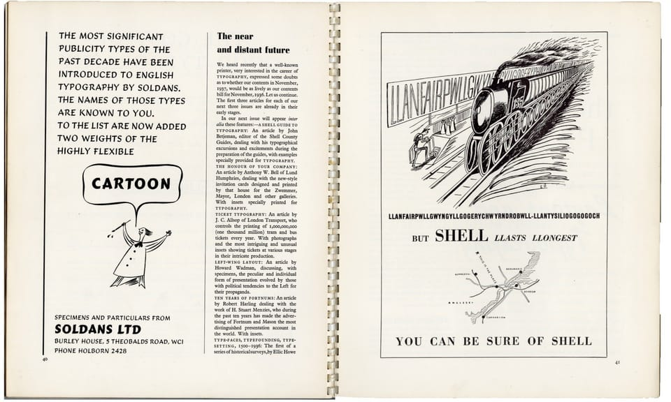
Harling was a supporter of Edward Bawden, who drew the Shell advertisement on page 41. In 1938 he used a wood engraving by Bawden's friend Eric Ravilious
on the cover
of Wisden's Cricket Almanac.
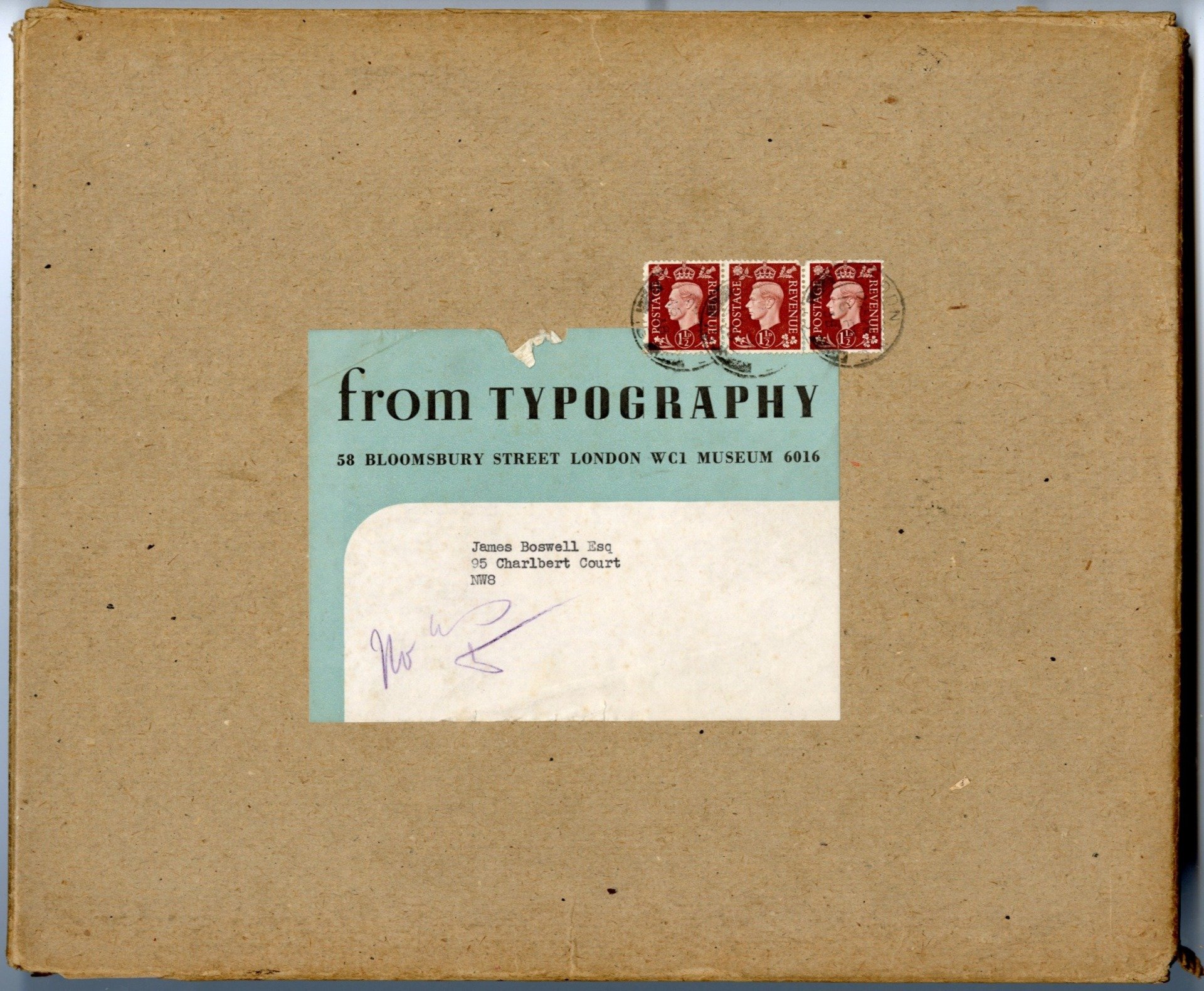
It pleases me that most of my set is still in the original mailers.
Sal Shuel recalls t he working life of the layout artist in the 1950s
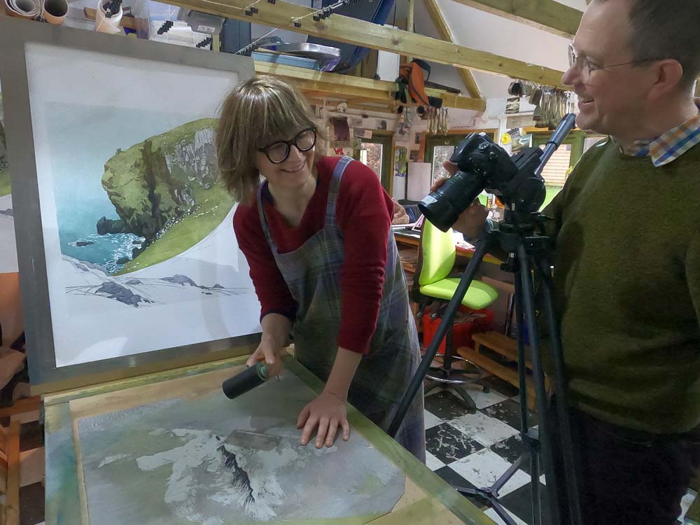
To set the scene, I am an artist printmaker. I specialise in linocuts and Japanese woodblock: figurative landscapes with the focus very much on light, weather and empty space. Mostly I work with reduction linocut: creating the print from one piece of lino which is cut away as layers of colours are printed, the block gradually destroyed as the print emerges.
We want this blog to cover the ups and downs of printing and publishing. Welcome to Kate Grimwade, Production Director at The Folio Society, our first contri butor . As I write, London has just moved into Tier 3 and fragile Brexit talks continue. Reflecting on an extraordinary year for book production, it feels a little like Groundhog Day as we continue to work with and adapt to continuing uncertainty. The nature of a Folio book, each one unique and most involving complex product development, relies on team work and collaboration between the production and design teams, usually crowded around the plan chest in our office, sifting through drawers full of material swatches, foils and so on. However on 18 March, I left our Bermondsey office in an Uber packed to the roof with boxes of cloth and leather swatches, folders full of coloured paper and text paper samples, foil and Pantone books, to set up a Folio production department at home. From that point on until lockdown lifted, it was ‘design by iPhone’, specs designed via Teams with reference to photographs and videos of cloth, paper and foil combinations sent via WhatsApp. Once the publicity dummies arrived – I’m on first name terms with our local DPD and DHL couriers as a result of their daily deliveries of proofs and dummies! - I’d photograph each using a pop-up light-box bought online and circulate for approval. This was where the responsibility felt particularly heavy. In normal times, publicity dummies are presented at a meeting with the art directors, editors and marketing department present, all of whom handle and critique them before they are approved for manufacture. Now all anyone had for reference were photographs. Th e Folio office opened on July 1 st and since then the production team have been in twice a week. It has been such a relief to see colleagues and to work alongside each other again. We are lucky, I understand that very few publishers have reopened their offices and are instead waiting until the new year. Our suppliers have been nothing short of magnificent. Our initial concerns in January were focussed on whether the books we produce in China would deliver on time, but of course this concern spread to our suppliers in Europe as the situation worsened in Italy and Germany. In most cases our account controllers were working from home too and communicating with their factory via Skype or Zoom, which made product development particularly difficult and slow. Despite all these challenges, since March we have taken delivery of four limited editions, forty new titles and numerous reprints. Alongside this, product development for our entire spring and summer 2021 collection is complete. This achievement is credit to our suppliers’ skill and dedication to our books As for Brexit, who knows? I am clinging to the rumour that the negotiations ‘have legs’. None of our European suppliers have been able to make significant preparations as, like us, they are unsure of what they are preparing for. We have pulled forward delivery of as many of our Spring Catalogue titles as possible, to minimise delays should there be a ‘no deal’, but like everyone else, we are in the lap of the gods. In addition, we have had to make contingencies for the delays at Felixstowe which look unlikely to be resolved soon. Here’s looking forward to 2021. Compared with what we’ve had to overcome during this past year, it should feel a breeze!